For this reason, I thought that I would do something to show my appreciation. Since I’m an artist, I decided to create a very special painting for my parents. The walls of Joanne’s parents are filled with many portraits of Joanne – that I’ve created over the last 15 years – while my parents have just a few of my artworks… so I thought this would balance things out a bit!
The idea of creating a painting for my mom and dad had been in my mind for quite a while, but I wasn’t exactly sure what I was going to do…
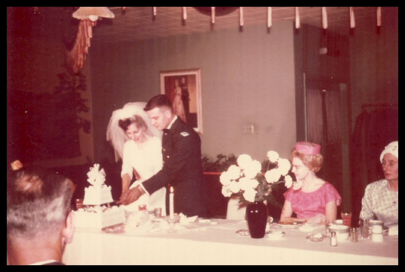
… until the day when we were sorting through some of the photographs that my grandfather had left for us. I found this old photo taken at my parents’ wedding.
I was struck with a lightening flash of inspiration! What could make a better ‘Thank You’ gift than a portrait from their own wedding?!!!
I spent several hours at my computer, fiddling around with different croppings and other ideas until I had created an interesting image that I would use for my blueprint. Then I had to go to a special print shop to enlarge the image to the size of the canvas that I had bought, so that I could eventually trace the image onto the canvas.

I taped the enlarged image to the back of my artroom door, where I spent the next week simply looking at the image – sorting out in my mind the many things that I needed to sort out before I began the painting.
Let’s take a closer look while I share some of the thoughts that went through my designing mind…

First thoughts led me to create this image in a monochromatic style (one colour). Since I wanted to create an image that reflected time – in a sense – I thought that a ‘gray scale’ painting would be appropriate.
My next easy thought was to get rid of the candle burning in the foreground. It was distracting.
I spent many hours looking at the shapes and forms that are seen behind my dad’s head – intense whites and deep darks. I could have looked at the original photo to see where those shapes had originated from, but instead I let my imagination wander, to see if they would inspire something within me. At first the brilliant white shape shifted into an angel and I toyed around with this idea for some time. Maybe a guardian angel would be appropriate for a wedding portrait. This thought just wasn’t sitting with me.
By the third ‘think’ day I just had to look at the original photo to figure out what had created these forms. Simply, I saw that there was a picture of another couple framed and hanging on the wall behind my dad’s head. This gave me a totally different idea that I toyed around with for the next few days. I remembered an old Pink Floyd album where there was an image in the foreground with a picture in the background. The background picture looked just like the foreground one and it also had another image in its background and so on and so on. Thoughts of ‘history repeating’ were moving through my skull as I thought that it might be interesting to have a painting in the background of my painting with an image of another couple getting married – and in that painting there would be another painting in the background of a third couple getting married! These thoughts made me dizzy!!!
It’s always a lot of fun figuring out the designs for any art creation – even if many of the ideas never get used. I ended up following a sacred rule… KISS (Keep It Simple Stupid)! I realized that I didn’t want a painting filled with symbols such as angels and I didn’t want to create an image that distracted from my original intentions – a simple portrait of two people in love cutting their wedding cake.
Next, I had to think about how I would fill the background. Quickly, I decided to create a simple texture using pointillism techniques. Since the left side of the image (the cake and my mom) is very light, I thought that I would create a texture to balance these tones by painting the background with dark colours. Since the right side of the image (my dad) is very dark, I thought that I would surround him with lighter background tones. The spaces in between would shift from the dark extreme to the light.
The final design elements that I had to consider where the almost white outlines and almost black outlines found throughout the image. At first I thought that these two lines did outline the cake, my mom and my dad completely, but I looked more closely and realized that this wasn’t quite so. So, I made it so!!!!! By extending a line here and there I was able to create two continuous lines of white and black that flowed through the entire image.
There! All my ideas where in place and now it was time to begin laying out the design that I would use.

After applying two coats of Gesso to the canvas – and letting them dry – I was ready to begin tracing the image onto the canvas. I taped four sheets of tracing paper together and made sure that they were facing the right way – graphite side down.

When I’m tracing an image I try not to think about what it is that I am tracing, but rather I focus just on the tones of colours and trace around them. This part of the image is my parents’ hands as they are cutting the cake. I didn’t try to trace the image of hands. I traced the groupings of colour tones found within and around their hands.

There! Tracing completed.
I’ve never been one to try to create a realistic representation of the subject that I am painting. If I wanted to do that I would have just enlarged the original photo and left it as is. By breaking down the photo into separate shapes based on colour tones I end up creating a ‘colour by number’ scheme and this give me a final image that is a bit more abstract. The colours and textures that I use create ‘moods’ and this is what art is all about, for me.
Now, for the paints…

This is my painting box, filled with small jugs of paints and empty mixing containers.

I mentioned that I wanted to create this painting in a ‘gray scale’ fashion, so many of you may think that I would simply use black and white paints. Rarely have I ever created a black colour using just black. And never do I use less than three pigments to create any colour for a painting.

The red and yellow will mix to create an orange colour. By adding a small amount of blue and a hint of purple I am able to push the orange into an umber or rust tone. My parents got married in the late autumn and rusty oranges are found during this season.

Then, I added lots of black to the orange to create the darkest tone for this painting. To this black I added a bit of white. To this colour I added a bit more white and so on until a complete gray scale had been created.

Many times, I will paint the border edge of the canvas first. This helps me to make sure that my colours are ‘good to go’ and it helps to get me in the painting frame of mind. I thought that I would try something new by adding three different colours onto my paintbrush before I applied the paint to the canvas.

Instead of painting a few strokes with the black and then adding strokes of the orange and then adding strokes of the gray colour, I dipped my brush into all three of these colours and then applied my strokes to the canvas. As you can see the colours blended themselves once applied to the canvas. I thought that this looked pretty cool!
Okay! The canvas has the design laid out, the paints have been mixed and I’ve completed my experiments and testing on the canvas border. Now it’s time to really get painting. To make this experience enjoyable for me, I always love to listen to some of my favourite bands…

Today, I thought that I would spend the afternoon listening to some of my vinyl records. I’ve got Cat Stevens and The Who from the 60’s and 70’s and Love & Rockets and The Alarm from the mid to late 80’s.
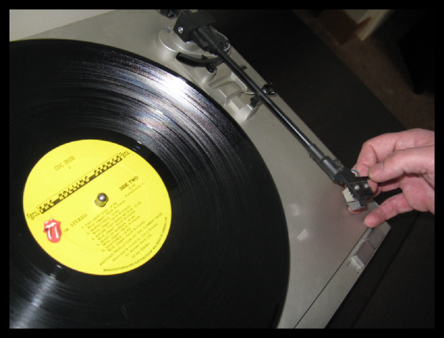
But first I’m going to slip on this Rolling Stones classic. Time to ROCK’N’ROLL!
http://www.youtube.com/watch?v=2q-G79h8y1U

Originally, my intention was to use only gray scale tones of my rusty/orangey/black for the entire painting. As soon as I started experimenting on the canvas border, these thoughts changed just slightly. I really, really loved the way the original rusty orange colour blended with the other gray scale colours and so I decided to use this colour some more on the actual painting… but just in the background. The rest of the design would still continue to be painted using only gray scale tones. It’s a little hard to see in this photo, but the occasional bits of the rusty orange colour really make the background sparkle with emotion.
The rest of the painting – the cake, my mom and dad – will be filled in with solid gray scale colours. I decided to use a texture that I’ve used many times in the past. I call it ‘Contour Painting’. I start by outlining a shape with the paint selected for that shape. Once this has dried, I paint another ‘row’ following the first outline. Eventually the shape gets smaller and smaller until it is filled in. It kinda looks like a topography map – or contour map – once it has been completed.

At the end of a very long and tiring day, I had managed to complete the entire background and most of the wedding cake. It was time to crack open a couple of cold beers, listen to some more music, sit back and spend time preparing my imagination for the most important phase of this artwork.

Since I had spent most of the afternoon, listening to music from my youth, I thought I’d bring myself into the new century and play a random selection of some of my newer CDs. I had some U2, Thornley, Mike Peters and Tegan & Sara ready to go!
http://www.youtube.com/watch?v=JfUD2N1tj7Y

It took me another five days to complete the wedding portrait for my parents – between shifts at work – and I had a great time! The only time I was really worried was when it was time to paint the faces. This always makes me nervous. I mentioned that during the designing phase I focus on tones of light and shadow, and not what the image really is. Faces always seem to do funny things when I follow these rules. Funny but good things!
I never actually try to paint ‘a nose’ or ‘the eyes’ or ‘the mouth’. The abstract way in which I break down the image still kinda baffles me, but it does seem to work.

There! Finally!! Done!!!

I think the neatest things in this painting are the white and black lines that flow throughout the entire design. Everything is outlined with these two colours. The outline begins near the bottom left – by the cake, then it sweeps over the cake to follow around the hands, just catching a bit of the wedding dress before it travels up my mom’s right arm and around her wedding veil. The line continues by becoming a part of my dad’s hair and then it circles his ear, traces his jaw and nose before joining up with his jacket until it traces the table and then exits at the lower right side of the canvas.
I’ve interpreted these two symbols in a fun way. The white outline is for my mom, the female, the guiding light. The black outline is for my dad, the man, the one who needs guiding – ha! ha! They are on a journey together but sometimes they become momentarily separated (the white and black line are not always side by side) as each line (person) journeys through life. The white outline is more efficient as it takes the most direct route through the painting. The black outline tends to go for small adventures and gets easily distracted but eventually finds its path again.
Hmmmmm…. that story sounds a bit more like my life with Joanne!!!!!
It took me a few more days until I had the title for this painting. I had thought of some obvious titles like “The Wedding”, “Autumn Love”, etc. and then suddenly “Wouldn’t Change A Thing” popped into my head. This title refers to a few things. We all go through so many experiences in life that shape us into who we are. Some experiences may not be as pleasant as others’ but it’s always healthy to reflect on these changes with no regrets – to have accepted the consequences of all of our decisions.
When I told Joanne the title that I had chosen, she laughed cuz she knew that my mom might have something to say about that – I’m always reminded of my years as a crazy teenager and how I drove my parents a little nuts! I laughed even harder and said, “Yeah, I know, that’s what makes the title so perfect. If I had been a better behaved teenager, stuck with one of my many decent jobs and had not become the free spirited ‘Earth Lover’ travelling around the country with just a few pennies in my pocket learning about art and life then this painting would never have been created.”
This has been a rather wordy blog – even for me – but I really want people to have a deeper appreciation for all the things that go into an art creation. Art isn’t just the final image that people see. Art isn’t simply a symbol of reflection. Art is a unique and special moment of inspiration catapulted through time, surrounded by life and evoked through labor with love.
Jim


 Posts
Posts

